Page Builder Sections
- 03 May 2023
- 2 Minutes to read
- Print
- DarkLight
- PDF
Page Builder Sections
- Updated on 03 May 2023
- 2 Minutes to read
- Print
- DarkLight
- PDF
Article summary
Did you find this summary helpful?
Thank you for your feedback
In the WineDirect page builder, you will have three options for updating your website. These options include adding drag-and-drop widgets, the layers your widgets are on your page, and theme attribute stylings. Below you will find more detailed information on each one of these sections.
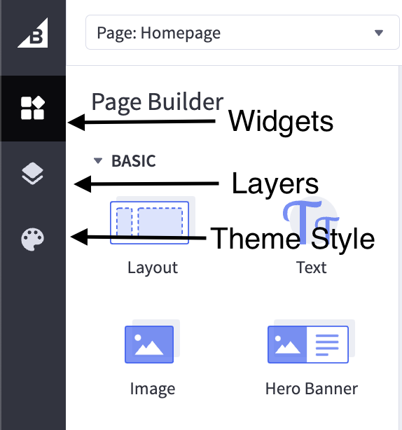
Adding Widgets in Page Builder
The Page Builder lets you easily add content (like text, images, banners, videos, and buttons) to your storefront. We call these blocks of content “widgets.” Widgets can be added to several of your store’s pages, including the homepage, product pages, category pages, brand pages, web pages, blog posts, search results pages, and cart pages. Depending on your theme, you may need to update your theme or edit the appropriate template files first.
To add a widget, drag it from the Page Builder menu on the left and drop it into any preset region.
After you drop a new widget on the page, it appears in the Design area on the right, and the Page Builder menu updates to show the widget’s configurable settings. You’ll edit the text directly on the page for widgets with text. The widget’s available style settings differ based on the type selected.
You can stack additional widgets by dragging them above or below existing widgets.

Page Builder Layers
This tool helps you see how existing widgets are organized on the current page. It lists the titles of all the available widget regions on the page
• Expanding a region will show any layouts that are in that region.
• Expanding a layout will show the columns in that layout.
• Further expanding the column will show the widgets in that column
In the Layers menu, you can drag and drop layouts and widgets to change where they are arranged on the page. Clicking an individual layout, column, or widget will bring up its related settings on the left.
Page Builder Theme Styles
When you launch Page Builder, the Theme Styles menu appears to the left of the preview area. This is where you can customize attributes (like color, font, and text size) of several of your theme’s design elements (like the header, logo, navigation, and footer). You can also turn other design elements off/on.
The theme’s elements are grouped based on where they appear on the storefront (like the homepage or checkout page) or what type of element it is (like a button or icon). The actual sections and their names may differ from theme to theme.

Was this article helpful?