Throughout our 2021 website accessibility audit, we have made several improvements to our templates and back-end code to allow users of all abilities to utilize our website templates more easily. There are a few instances where some changes need to be added manually by a designer on a template-by-template basis.
We recommend contacting one of our certified designers to implement the changes below.
Dynamic Email Widget Label
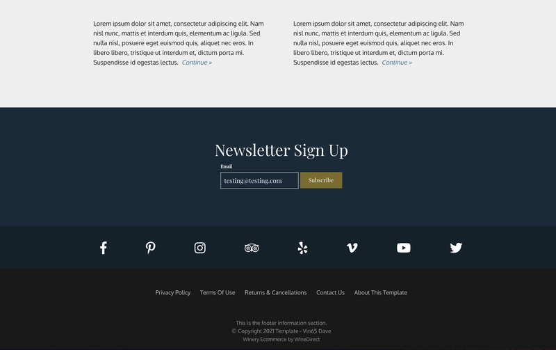
The Dynamic Widget Email Label is a small label that appears automatically above the "Email" text box of our email subscribe widget when a user clicks into the text box. See below screenshot as an example.
JS to Implement
$(function(){
var onClass = "on";
var showClass = "showLabel";

$("#v65-emailSubscribeWidget").bind("checkval",function(){
var label = $(this).prev(".v65-emailSubscribeWidgetLabel");
if(this.value !== "" && this.value !== "Email"){
label.addClass(showClass);
} else {
label.removeClass(showClass);
}
}).on("keyup",function(){
$(this).trigger("checkval");
}).on("focus",function(){
$(this).prev(".v65-emailSubscribeWidgetLabel").addClass(onClass);
}).on("blur",function(){
$(this).prev(".v65-emailSubscribeWidgetLabel").removeClass(onClass);
}).trigger("checkval");
});
CSS to Implement
None needed!
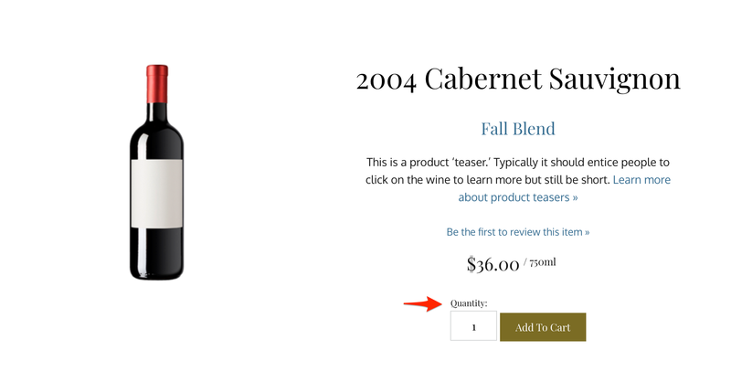
Quantity Labels to appear on all quantity boxes on the site
Quantity Labels are added on top of the Quantity boxes for products that show up on the homepage, product list, or product drilldown page.
Note: We offer CSS suggestions on how to make this label appear aesthetically pleasing on most of our templates, however you may still need to make css adjustments.
JS to Implement
None needed!
CSS to Implement
label.v65-quantity-label{
display: inline;
}
input.v65-quantity-box, input#v65-quantity-box, #v65-subsku-quantity-box{
margin-top:1.2rem;
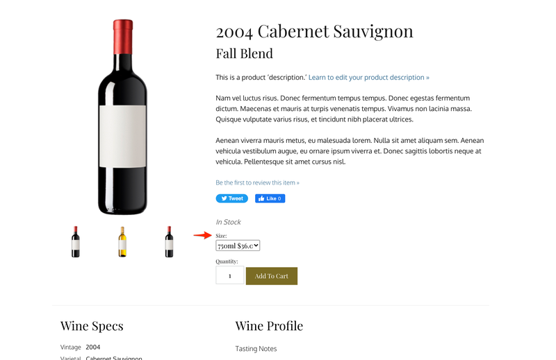
}SubSku Dropdown Label
SubSku's are added on top of the Size boxes for products that show up on the homepage, product list, or product drilldown page.
Note: We offer CSS suggestions on how to make this label appear aesthetically pleasing on most of our templates, however you may still need to make css adjustments.
JS to Implement
None needed!
CSS to Implement
.v65-subskulabel{
	display: block;
}

.v65-product-addToCart-selectBox {
    margin: 1em 0;
}
Navigation Expansion Icons
The Navigation Expansion icons are useful little icons that are hidden by default, but reveal themselves when you navigate through the main navigation bar using the "tab" button.
Highlighting and pressing "enter" on these icons will expand that menu's submenu. From there, you can navigate through the submenu. Pressing enter on the icon again, or clicking on it with a mouse, will close the submenu.
JS to Implement
Add this is your scripts.js file above "vin65.global.init()" at the bottom of the page.
$('body').on('keyup', function(e) {
	var currentActiveElement = $(document.activeElement)
	if(e.keyCode == 13 && currentActiveElement.hasClass('v65-subMenuAccessibilityIcon')) {
		if(currentActiveElement.hasClass('activeIcon')){
			currentActiveElement.removeClass('activeIcon').trigger('click');
			currentActiveElement.siblings('ul').removeClass('dropDownShow');
			currentActiveElement.siblings('ul').children().children().attr('tabindex' , -1);
		}
		else{
			currentActiveElement.addClass('activeIcon').trigger('click');
			currentActiveElement.siblings('ul').addClass('dropDownShow');
			currentActiveElement.siblings('ul').children().children().attr('tabindex' , 0);
		}
	}
 });

 $( ".v65-subMenuAccessibilityIcon" ).mousedown(function() {
	if($( ".v65-subMenuAccessibilityIcon" ).siblings('ul').hasClass('dropDownShow')){
		$(document.activeElement).removeClass('activeIcon').trigger('click');
		$(document.activeElement).siblings('ul').removeClass('dropDownShow');
		$(document.activeElement).addClass('v65-invisible');
		$(document.activeElement).blur();
	}
  });
CSS to Implement
Enter the below into your site's _navigation partial. Then sass compiles the partial.
Alternatively, you can add it to the appropriate navigation section of the screen.min.css file.
.v65-subMenuAccessibilityIcon{
	position: absolute;
	transform: rotate(90deg);
	font-size: 12px;
	margin-top: 0.9rem;
	margin-left: -1rem;

}

	@media screen and (max-width: 768px){
    .v65-subMenuAccessibilityIcon{
		margin-top: 1.2rem;
    }
	}

.v65-icon-selected:before{
	transform: rotate(90deg);
	animation-name: spin;
    animation-duration: 4000ms;
    animation-timing-function: linear;

}
@media screen and (min-width: 580px){
	.v65-subMenuAccessibilityIcon:focus {
		position: absolute;
		opacity: 1;
    cursor: pointer;
	}
}

.activeIcon{
	position: absolute;
	opacity: 1;
	transform: rotate(0deg);
}